Wednesday, 3 February 2016

Photographers

Don McCullin, Is a Famous British Photographer who has been working in the photography field since 1959. In Particular, he is very well known for
His pictures to do with war and internal strife. He mainly focuses on photos that show the side of the world that is always there but people tend to forget such as unemployment and Poverty.


Don McCullin was born in Finsbury Park, London, in 1935.However, he was evacuated during the Blitz to somerset and attended secondary school there. despite being severely dyslexic he displayed talent in drawing and arts. so much so, he went to Hammersmith School of Arts and Crafts purely on a full scholarship. He left school at 15, with no qualifications and worked on the Nation Railway as a caterer, He then got called to the National Service and worked in the RAF.

The Fact that he may have been severely dyslexic have impacted greatly on the pictures that has he has taken because he can relate strongly to those who are also disabled in some other way, which is why the shell shocked soldier also relates to the life of McCullin to an extent. This also makes his other senses heightened. His work in War Zones are highly regarded as they publicly show the rest of the world what some people are going through and how sympathetic we should feel or them such as the Shell Shocked Soldier who is now scarred for life, yet his innocence is still there.


His most famous and celebrated picture is this one.
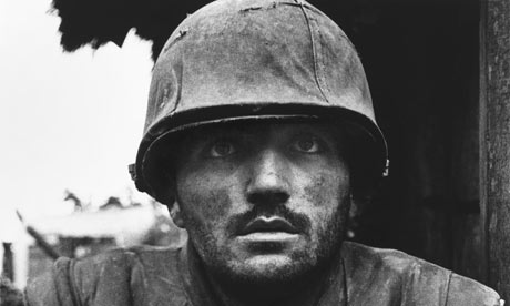
Shell-shocked US marine, Hue, Vietnam, February 1968.
This was taken during the Vietnam war in the City of Hue. It shows the idea of intensity and silence which were heard throughout the war. It shows the effects of fighting on this particular young soldier and gives the same message out to other young boys fighting in Vietnam. The important part is that the man is not looking directly at the camera but above it signifying that he is staring into nowhere much like the Vietnam war.


David Bailey is another Famous British Photographer who was born in Leytonstone in East London in 1938, Bailey attended Clark's College in Ilford, however as an undiagnosed dyslexic and Dyspraxia he faced problems at school where they didn't teach even basic essential education.


His attendance in school was incredibly low to the point that he left the college when he was 15 to become a copy boy at the fleet street offices of the Yorkshire post as he believed that would be more beneficial for him. He then had a rough couple of years stuck in dead end jobs before joining the RAF when he was 19. He bought a Roliflex camera during his time serving in Singapore as he realised he had to pursue something more creative. He left the army in 1958 and was ambitious to begin his career in photography. He couldn't get into the prestigious school "London College of Printing" because of his disastrous school attendance record I.e in one year, he only went in 33 times. He therefore worked he became a second assistant to David Ollins, in Charlotte Mews. £3.50 a week, and acted as studio lackey. He was delighted to be called to an interview with photographer John French and his career sped up from there..


He started working around the same time as McCullin. However, he specialises in a different fields rather than suffering


 Bailey chooses to photograph Fashion and is considered to be a portrait photographer.


He is famous for photographing famous people. He has photographed many celebrities and was extremely popular in the 1960's
including: The Beatles, Kray Twins, Andy Warhol and Jean Shrimpton and even Mick Jagger.
Here are some examples of his most famous work:
Laurence Olivier

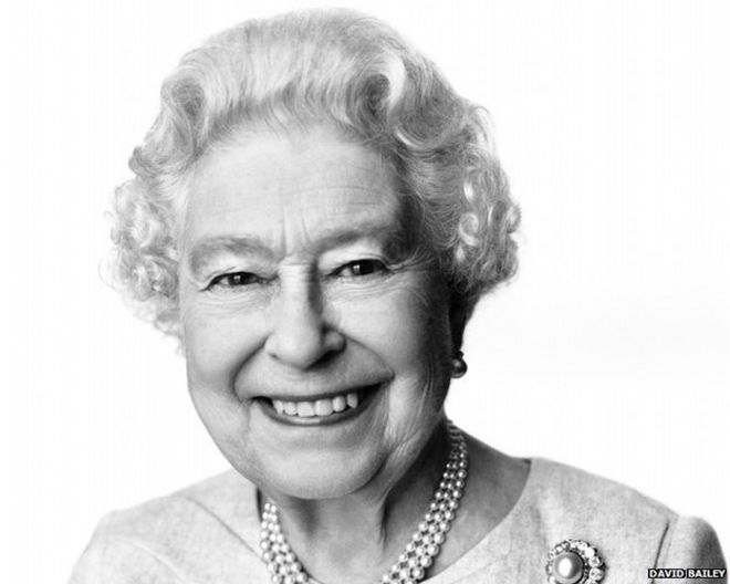
Queen Elizabeth II
Audrey  Hepburn
I Chose this pictures in particular because i wanted to show the extent of the work that he has produced. These are some of his most famous shots and he even has had the honour of taking pictures and creating the portrait of HRH Elizabeth II. Which not many photographers have the honour to do.


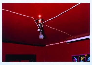
William Egglestone is an American Photographer and has been working in the picture business around the 1960's and 70's.  He is credited as he increased recognition for colour photography. His most notable piece of art work is known as The Red Ceiling. He is famous for photographing other photo's in colour definition.


Egglestone was born in Memphis, Tennessee in 1939 and was raised in Memphis. He grew up as an introvert and was not incredibly sociable, he enjoyed staying indoors by himself, playing piano, games and working with electronics. from an extremely young age, he was seen making collages by cutting up postcards and magazines to make  a new picture. when he was 15, he went to Webb school which was  a boarding establishment. As it was an all boys school, he felt that the school pushed it's students away from creative things like art, drama and music because they were all considered "effeminate" which the school frowned upon greatly.

William attended may different school over the next few years, these included  Vanderbilt University (for a year)  Delta State College (for a semester) and University of Mississippi AKA Ole Miss (for 5 years) none of these resulted in a degree or any qualifications. But he did discover his knack for photography but friend at Vanderbilt gave Eggleston a Leica camera. Eggleston studied art at Ole Miss and was introduced to abstract expressionism by visiting painter, Tom Young. This resulted in the artwork he has produced to this day. Here are some examples:


The Tender - Cruel Camera, 
Perfectly Banal, 1976

Untitled, 1965-68 and 1972-74


The Red Ceiling AKA Mississippi 1973
This Photo in particular was considered to be his most challenging piece of work and his most famous. This stands from his other photos which use lighter and more retro colours. The most significant aspect of this picture may be the white wires contracting with the deep red ceiling. This Photo is also known as Mississippi 1973 in honour of the place and year it was taken as Egglestone himself considers it be his most recognisable and most exempt piece of artwork.


Martin Parr is a British Photographer, photo journalist and photo collected. He was born In Surrey in 1952.
He is credited in taking pictures that are intimate, anthropological and satirical and looking at the aspect of Modern life in Britain. He looks mainly at Social Class and the wealth of the Western world.


Parr was particularly famous for creating the photographic Project "The Last Resort" which was looking at people enjoying a day at the beach in New Brighton in 1985. However, the pictures aren't of happy family's or smiling children but rather a day looking at the resort alive with greed and disgust  such as an overcrowded café or a over litter bin and people are eating fast food sitting right next to 3 day old rubbish. He is making a satirical comment with these pictures showing us how the middle class act at the beach when they are not acting how they should be and are acting like lower class folk.

Tuesday, 26 January 2016

Woman's Own


Facts and Analysis of Woman's Own Magazine.
  • Woman's own is a British Lifestyle Magazine was 
  • It was first published in 1932. The Magazine is still in publication and therefore has been in circulation for 84 Years as of 2016.
  • considered to be one of the Uk's most famous and most read woman's magazine. 
  • it's Target Market is mainly aimed at females in Britain. 
  • The Company t hat published it is called IPC media (International Publishing Corporation)it is now known as Time Inc. UK and that has been running for the last 48 years
  • Woman's Magazine features different segments these are: Competition, Celebrity, Fashion, Hair & Beauty, Travel, Lifestyle and Bingo.
  • In the 2004 Edition of the Magazine it also features Real Life Stories, Truth or Fiction?, Shopping, Fashion, Food News, Your Health, Miracle Makeover, Your TV, Guilty pleasures, Tell Michelle, Consumer Crusader, Fantail. Crossword, Travel, Horoscopes, Woman Own Shp and other prize competitions
  • This Magazine is also a weekly magazine rather than monthly like other magazines.


Woman's Magazine 2016


Masthead- This is the Name of the magazine as you can see it is bold, white on a pink background in order to stand out and attract the women's target market


Tagline - Their is not tagline for this magazine name but people can understand from the  masthead is produced specifically for Females


Central Image - The central image of this magazine is a  Carol McGiffin posed next to a small photo of Mark Cassidy who has been her spouse since 2008. . who is smiling. People can look at this before reading  the magazine. It is relevant to the purpose of this weekly issue.


Anchorage- In this case the anchorage is "Carol and Mark: It's Hard Saying Goodbye - Couple Ready to Move on. Refers to Carol battle with Breast Cancer and how she finally was cleared. It gives reader's significance on the subject


Secondary Images -. These are other images that appear on the page of the magazine. Which promote other minor articles in the magazine. in this case it is Georgia May Foote (who appeared on Strictly come Dancing) 'Tearful Bust up' as well as a real life story about "Death in Paradise." This advertises that the article has a variety of different content.


Cover Lines - This is located on different points of the cover to tempt readers into doing different things, I this case it's says in the bottom left- hand corner it says " Join Slimming World for Free!"


Puff - This is to promote and draw attention to something about the magazine such as a crazy deal. It is usually in a distinct shape and doesn't blend in with the rest of the page. This magazine cover features it when it says "Flats that Flatter! From £12 in the white box at the bottom of the page.


Barcode/Price/ Edition - The Barcode has been placed in the middle of the magazine in a way that doesn't draw attention or take any away from the front cover. it is below the main anchorage. The Price and edition is above the Masthead so that you can read the title whereas you are looking at the price and checking if it's the latest issue. It is White on a pink background and is clearly visible.


Use of Colour and Font - This particular issue has a pink & Purple & white theme. This is probably used to attract female customers as they are all considered to be quite feminine colours. This Particular  issue may be coordinating the colours of the Central image as Carol's hair is a dark purple colour and her shirt is also a deep purple. The Pink Could be used to represent Cancer support which carol is going through at the time the magazine was being produced.


Wednesday, 20 January 2016

UNIT 51 and History of Magazines


This Unit is called Page Layout and Design and it is mainly based around creating an d putting together a Magazine cover

L/O

1) To be able to edit and process text to meet the brief
2) To be able to source images to meet the brief
3)To be able to prepare images to meet the brief
4)To be able to design & produce a page layout to meet the brief.

Types of Magazines

1) Consumer Magazines 

2) Business/ Professional/ Trade Magazines

3) Newspaper Supplements

4) Partworks

5) Academic Journal

History of  Magazines (according to magazinedesigning.com)

The First Magazine ever created was in 1663, it was a german magazine called Erbauliche Monaths Unterredungen, this was aimed at Intellectual people.

Magazine comes from the Arabic word "Warehouse" which is place that is described as containing various  goods which is also technically what a magazine is.

19th Century
  • Magazines were available to Middle Class as well of Upper Class as of the Mid 19th Centaury.
  • This was also the start for many family magazines such as Dickens Household Words.
  • Attempts were also made at this point to cut the price of magazines, however ads were loaded with special tax, until about up to 1853.
  • Technological involvement started and therefore there was an increase in circulation and a further use of images,
  • this made the magazines look more attractive and advertisers started to notice this. The first advertising Agency started in 1890.
  • Good Housekeeping, National Geographic and Harper's Bazaar were all introduced during this time period by William Randolph Hearst
  • Vogue, Vanity Fair and Time (news Magazine) was also started by Henry Luce, who is by today standards, considered one of the most influential publisher in history.
  • Cosmopolitan started in 1886, as a house magazine.

Luce and Hadden
  • Luce actually stole the magazine idea for Time from a colleague at Yale, Britton Hadden
  • Hadden was the editor of Time Magazine and actually introduced the concept of a political news magazine. He was editor of the Magazine and well respected at this point. He started the same company that issue very well - known magazines such as Life, Sports Illustrated and Money, later in the centaury.
Hadden changed the way that people look at magazines in the 20th Centaury, However he died at the age of 30 due to the flu. Henry Luce continued his Legacy as developing Time Magazine for the next few decades.

Fortune Magazine and Colour
  • Fortune Magazine was published in 1929 which was an spinoff from Time. It was based very much around the world of business and was considered the best magazine in that sector. It is known for being the very first high quality print magazine, with colourful and bright pages especially that the irony was that it was a business magazine.
  • Fortune is also credited with inventing Photo - Journalism which proved to make Life magazine famous in years to come. This was expensive to print and ultimately starts to lose money.
  • in 1948, Fortune becomes an ordinary business magazine.
Women and Magazines
  • Post WW2, in 1945, Helene Gordon Lazareffe and her husband Pierre launched Elle Magazine (French for 'she') which gave women a voice and changed the way that they were viewed, how they think and how they speak.
  • Elle instructed women to be nice and attractive
  • The magazine was extremely successful
  • Helene promoted the then unknown designer Dior's fashion and put the then unknown designer Brigitte Bardot on the front cover in 1950.
  • She employed François Giroud, who was a feminist that ran a weekly political magazine L'Express
  • in 1958, Despite unpopularity in France, Helene promoted and advocated for the return of Coco Chanel.
  • Elle predicted a vision of the future in white clothing in 1965.
  • It was a week to week magazine meaning every week a new edition was released
  • Reached one million sales in 1960 at this point 1 in every 6 French women read Elle weekly
  • Elle left the magazine 1972, when it was at it's peak number of sales
  • When She died of Alzheimer's in 1988, Elle dropped down to 370,000 Copies

Golden Era and Mad Man

  • Magazines were popular in 1950's in New York.
  • Madison Avenue was location of the largest magazines in that decade
  • Creative Revolution started in Manhattan. This is when the new generation of designers and art direction which we still use in 2016 started here. As well as an established design and magazine advertising.
  • Magazine Giants worked in progress in Manhattan such as Alexey Brodovitch for Harper's Bazaar, Leo Lionni for Fortune, Henry Wolf for Esquire and even Art Paul for Playboy.
  • Because this was before modern technology, everything was done by hand and therefore it was very difficult and time consuming.
  • Took about 4 months to produce a single issue at this point.
  • Esquire Magazine was a huge hit in this era, It transformed the magazine from men using specific art direction from Henry Wolfe. it increased sales majorly from 1933 to the end of the 1960's
Further Progress of Magazines


  • Twen was released in Germany in the 1970's. it was a magazine aimed at younger audiences with erotic images and Intelligent articles. the main purpose of Twen was to sway the mind of the youth at that time differently than the previous generation. They succeeded.
  • Celebrity magazine also emerged in the 70's. People magazine was first published in 1974. This has been the best selling magazine type ever since. 
  • Cosmopolitan gained popularity as it was readjusted so that Women were it's target market in the 60's this made it extremely Popular.
  • Fashion magazines also boosted around the 80's. This Includes Vogue and Harper's Bazaar.
  • Vanity Fair was reissued in the 1980's.
  • British Magazines are were the most popular and successful nationality on the Shelves in the 90's such as Face and Arena, got shutdown in 2000's.
  • Specialized Magazines also grew in the Nineties such as Wired, which to this day is the best niche magazine. This looks at the growing world of technology and cyber information


Overall, We can understand that Magazines to this day are still fairly popular despite the decrease in numbers and although numbers may still go down. They will Never Die Out. New Technology such as the Ipad and Photoshop give us hope for the future that there will be a crossover between those and magazine production. 

However, as the days go by, People are letting the feel of the page slip through their fingers and swiping and pressing buttons to look at articles. Some people need the feel of the paper pages for sure 

Magazines have helped many people lives with it's wisdom in make up and fashion as well as what to eat, what to think and how the world is changing around us in so many aspects.
I personally see no reasons why magazines should stop producing but who know's what the future holds for them?

Thank You for Reading.


Monday, 18 January 2016

Overview of Unit 1

In the following blog, i will be discussing how both the information In Assignment 1 and Assignment 2 therefore impacted on the outcome Assignment 3 and the process in which it lead to the end result of the advert that i have produced in Assignment 3.

In Assignment 1, I produced a completely different idea for Subway which never actually made it into the final cut. This available to view on a previous blog. However, some of the elements of the previous idea that i created actually did make it into Assignment 2 and furthermore into the final advert in Assignment 3.  However, The information that i researched about Subway including the current franchises, number of sandwich combinations and the my sub my way campaign all were part of assignment 1 that made it into the final stage of the project.

In Assignment 2, I believe that the Majority of the idea that we pitched did go to plan in the final advert as we did promise when presenting, However, difficulty with certain issues did arise, which i will discuss.  It should be noted that we filmed the Advert twice on 2 different days with different actors, for reasons for which I will explain. (we went with the second draft)

Firstly, The Location was not what we said it was. this is due to the fact that the Sixth Form Common Room (that we had already scheduled to film) conflicted with my partner's idea because it was deemed to mess, despite we got permission from the Head of Sixth Form. Also the room was too noisy and with people being in the Common Room, their voice would have been heard
in the advert ad therefore ruined he final advert. The Boardroom and Science Lecture Theatre we were not given permission for and moreover, we could not use it. The reasons being were that the Boardroom were being held off in case of an emergency such as as an extremely important meeting and if we were to use it during such a time then we cause issues with the staff at such a time. The SLT was being reserved for mocks and we couldn't use it. We settled for H114 which was used in the final advert.

The Food in the Advert was not what we said in the First Draft. In the first Draft due to the local food sources being closed (Cafe and Canteen) we did not have the time to get the food by the time we had to film. Luckily, one of my classmates had a chocolate bunny which he was given from Secret Santa which we used in the advert. However, it did not look good and it was not the fancy meal that we hoped for. it also didn't work with the props that i had provided with. Another Issue was the Sandwich.

My Partner's responsibility to provide an actual subway sandwich was not met and he only printed out a piece of paper with the subway logo on it. I took the responsibility to get the sandwich from the canteen as a last minute resort despite the fact that we promised a real subway sandwich in the brief but not a look alike. In the Second Draft, I actually went out a bought a "fancy meal" (Fanciest Possible Ready Meal that was available in Morrison's) Which turned out to be a Cannelloni which made it's way to the final advert. however due to my partner's failure to provide the sandwich again, i had to buy another sandwich from the cafeteria but although a real subway sandwich didn't make it into the final cut the advert was idea was still there with the final subway logo at the end. We went with the Second Draft in the finishing advert,

However, I can say proudly that despite these issues, The final advert we delivered met the rest of  criteria of which we discussed in the pitch. I believe to a large extent that the advert is very accurate and successful compared to what I planned overall.

Tuesday, 5 January 2016

Minutes

Monday 7th December 2015 : Theory


Present at the Meeting:


Talia Wolf
Ilia Katz
 
Agenda:
  • Where and When we are going to film
  • When We are going to Book the Camera's.


Decisions Made:
  • We have Decided to film in the Science Lecture Theatre and will use the Boardroom as a Backup. I have Decided to ask for it's availability.
  • We have Booked the Camera for Thursday 17th December
  • We have Decided to Film Thursday 17th December during Period 5 and 6
Tuesday 8th December 2015 : Theory


Present at the Meeting:


Talia Wolf
Ilia Katz


Decisions Made:
 
Agenda:
  •  Who is Playing who
  • Costumes and Props
  • Who will be in charge of the Camera and discuss positions of filming
 
Decisions made:


  • Ilia will ask Mark, Elliot and Ollie and Danny to star in the Advert as the roles of Waiter, Diner#1, Diner#2 Respectfully.
  • Both the Science Lecture Theatre and Boardroom are booked for Exams, We will use the nearest available room which is H113.
  • Actors would have to provide on Clothes
 Monday 14th December 2015 :Shooting

Present at the Meeting:


Talia Wolf
Ilia Katz
Gabriel Spalter
Eli Sears
Brandon Kransnik


Agenda:
  • Film the Actual Advert
 
Decisions Made:
  • We Agreed that Ilia would Provide the Subway Sandwich, I Will Provide Fancy Meal, Cutlery, Plates, Cups Napkins and Cloches
  • Due to Unavailability, We Will film using actors, Eli, Gabriel and Brandon
  • The Meal used was a chocolate bunny due to Sudden Café Closures.
  • We Decided to reshoot the Advert, using Different actors on the previous decided date (17th December)
  • Ilia Would brief the actors and I would set up meanwhile.
Thursday 17th December 2015 : Shooting

Present at the Meeting:


Talia Wolf
Ilia Katz
Neve Grant
Tom Cohen
 
Agenda:
  • Film Second Draft of the Advert


Decisions Made:
  • Final Reshoot of the Advert was on this Date and
  • Different Actors are going to be used
  • We Agreed to use different shots such as Zoom and Close Up Shots rather than just a wide shot that we were using previously.
  • Ilia would play the Waiter as a last minute desperate measure due to lack of actor at that time,
  • I would man the Camera
Monday 4th January 2015: Editing
Present at the Meeting:
Talia Wolf
Ilia Katz
 
Agenda:
  • How we are going to edit the Advert.i.e Transitions and Camera Angles
  • Discuss the Subway Logo appearing in the Advert
  • Music in the Background
  • Final Idea of what the advert should look like.
 
Decisions Made:
  • Ilia would take charge in Editing the advert itself and would sort out transitions and logo appearance at the end
  • Talia will work on the audio visual synchronisation of the Advert and the Background music playing during its run
Monday 11th January 2015: Editing
 
Agenda:
  • Finish Editing the Advert
  • Finalise Music choice for the background
  • The Subway "My Sub, my Way" Symbol
 
Decisions Made:
  • We have decided Overall, to use Mozart eine kleine nachtmusik 2nd movement, we did this to provide class to the advert and give viewers an overall sense of the atmosphere.
  • We created & placed the My Sub my Way logo at the end of the advert
  • Finished Editing Overall


Tuesday, 1 December 2015

Subway Prezi & Advert

it's been a long time since i've posted on here because i've been completely swamped in work in the last month. But nonetheless, i am going to tell you what i've gained from working in Creative Media in the last 30 days.

First of all, i made a Prezi on Pre - Production Techniques. using this, i created a fictitious pitch regrading Subway Sandwiches to McCan Erickson Advertising Company. I did this individually. Here it is to view for your leisure. The aim of the advert that i was pitching was it was going to be promoted for 2016 Olympics Rio de Janeiro.  The Advert was going to feature famous athletes from across the globe who all had their own specific type of Subway Sandwich and how it helped them win that particular competition.

The Prezi itself featured costings, locations, every type of personnel involved and most of all the goodness that subway gives to the rest of the world. Please feeler to watch and learn. Please Note that all costings in the Prezi are completely Hypothetical and are solely based on research. I also did not of this for actual making rather than an assignment i was given in school.


Also in Unit 1, we have been given the actual opportunity to create an Advert for a company of our choice. We have to pitch to McCan Erickson and because i already researched subway. we decided to go with them.

This time i made a Powerpoint and talked about every single detail involved in the making of this Advert. This was the planning stage rather than who was going to be involved.

This advert was very different. it focused ion 2 very posh men who both order from the same restaurant while one ends up with a beautiful gourmet meal, the other has a subway sandwich and despite this the gentleman with beautiful meal asks for a bite of his sandwich despite the gold comparison food that he has got in front of him. The second man simply replies 'No." The advert ends by promoting Subway's new hypothetical campaign "Nobody is too good for subway"

My Partner and I planned very single detail of this advert down to the last second. (Only 10 seconds in the first place) We managed to decide on music, costumes, props personnel and even the storyboard (Which was represented by Emoticons)


These Videos below are of my partner and I presenting the the pitch for the advert and the advert in question


Thank You Very Much for Reading

All the Best


Talia


Monday, 2 November 2015

Pre Production Techniques

This is my Prezi for Unit 1 Pre Production Techniques.

I have chosen to use Subway sandwiches as my client for an advert advertising Subway's My Sub, My way Campaign.

The Main aim of this Prezi was to show my understanding of all the pre production Techniqes involved in making a 30 second national advert.

This is all Hypothetical and I do not plan to actually make this advert.

I hope you enjoy!

Talia